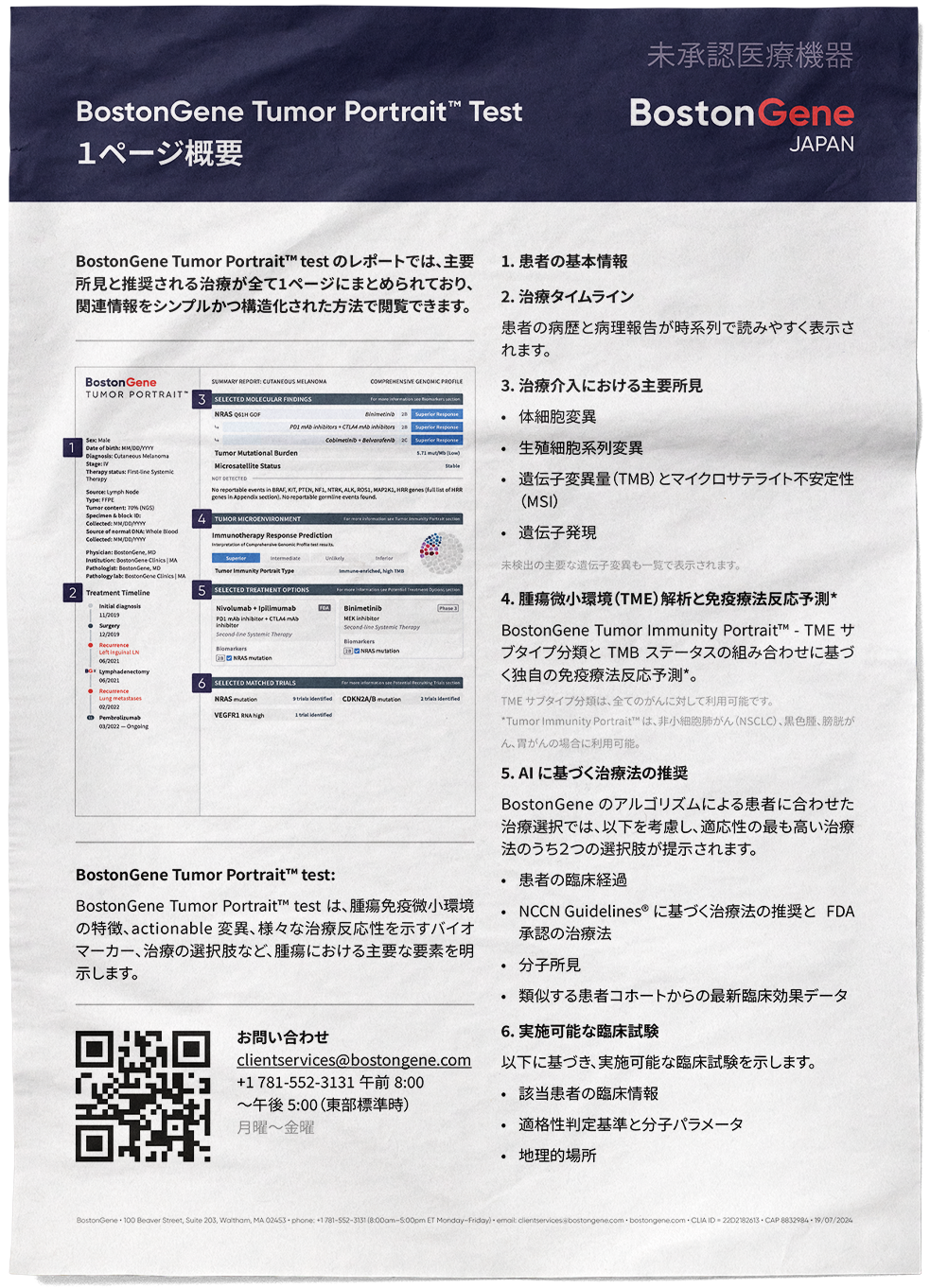
This is a design samples, actual on 12.2023
BostonGene Test Requisition Form (Print)
A two-sided form used by physicians to order the Tumor Portrait genomic test. It was completed by hand, scanned and sent to client services. I designed it from scratch.
Problems the form had to solve
1. A large amount of data in a single document.
Processing an order requires patient and physician details, payment method, clinical information, the selected test, specimen type, the physician’s signature and the patient’s consent. I divided the form into eight numbered sections with high-contrast black headers, arranged in the order in which a physician typically gathers this information. Reference material was moved to the back page, so the front remains a working surface.
2. Incomplete orders.
Client services had to spend time requesting missing data. I marked the blocks required for payer coverage determination with a red outline and notes, and added a reminder in the clinical section to attach the physician’s note or clinical history summary. On the back page, a checklist lists the required and optional supporting documents.
3. Missing signatures and consents.
Orders without a physician’s signature delayed payment and required resubmission. The physician signature block and the patient consent block use the same red accent. The front page also carries a separate reminder to obtain patient consent on the back page.
4. Complex conditions that need to be explained to the physician.
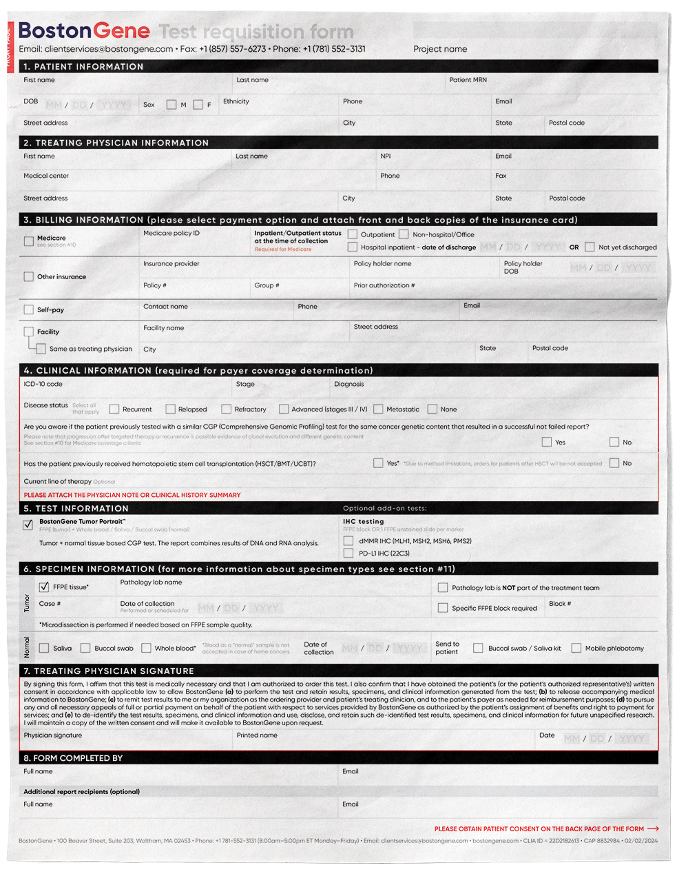
Medicare requirements, specimen types and their limitations cannot fit into form fields. I collected them into reference tables on the back page (sections 10 and 11) and added cross-references within the fields, so the physician can find the rules at the moment of filling in the form.
5. Multiple ordering scenarios.
Payment through Medicare, private insurance, self-pay or a facility; different specimen types; optional add-on tests. I addressed these with checkboxes, fields grouped by scenario and a consistent date format.
Outcome
The form became the foundation of the ordering process that was later moved online.
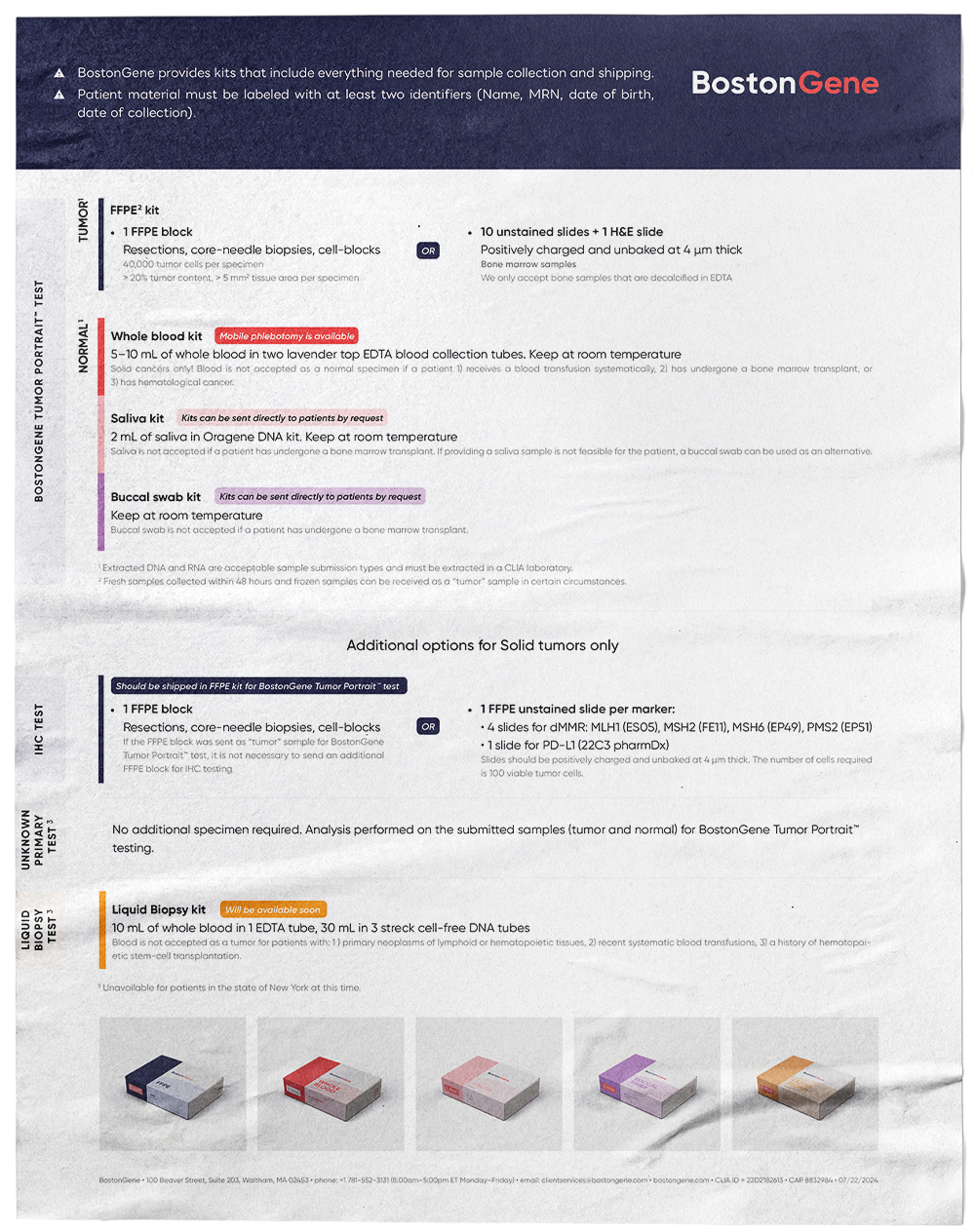
Test Requisition Form Overview and Specimen Guide (Print)
A two-page brochure that accompanies the BostonGene test requisition form. It explains how to complete the form and which specimens to send for each test. I designed it as a companion to the form, so that physicians and their assistants could place an order correctly on the first attempt.
Problems the brochure had to solve
1. A dense form that is difficult to approach for the first time.
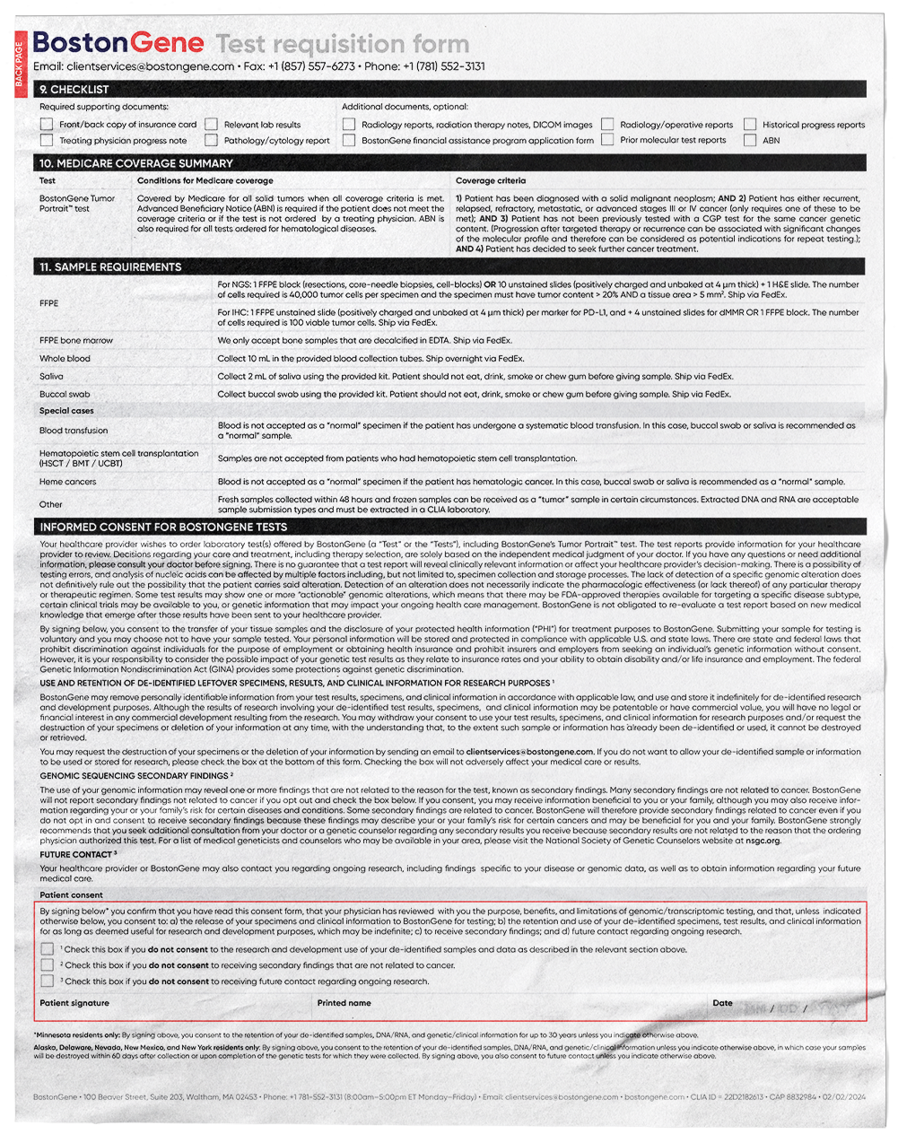
The requisition form contains eight sections and a large number of fields. On the first page of the brochure I placed a miniature of the form with numbered markers, each linked to a short instruction in plain language. A reader can see at a glance what each section is for and which parts require attention, without reading the full form.
2. Missing signatures and consents.
Incomplete orders delayed processing and report delivery. In the overview, the physician’s signature and the patient’s consent are marked with separate red indicators, both on the form miniature and in the text. A note at the bottom of the page states the consequence of omissions directly: delays in order processing and report delivery.
3. Complex specimen requirements.
In the original form, sample requirements were a long reference table. For the brochure I rebuilt them as a visual structure organized by test: Tumor Portrait (tumor and normal specimens), IHC, Unknown Primary and Liquid Biopsy. Alternatives are marked with an “OR” label, and the optional tests are separated into their own block for solid tumors only.
4. Errors in choosing a normal specimen.
Some patients cannot provide certain specimen types, for example after a blood transfusion, a bone marrow transplant or with hematologic cancers. I placed each restriction directly under the relevant kit, so the rule is visible at the moment the physician chooses the specimen type, and not in a separate list of exceptions.
5. Connecting written instructions with physical kits.
Each specimen type has its own color, and the same color is used on the kit packaging, shown at the bottom of the page. A physician who receives a kit can immediately match it to the instruction. Short badges highlight service options (mobile phlebotomy, kits sent directly to patients) and product status (the liquid biopsy kit marked as coming soon).
6. Mislabeled or incorrectly prepared samples.
The key rules that apply to every order are placed in the header of the second page: kits contain everything needed for collection and shipping, and every specimen must carry at least two patient identifiers. Technical requirements, such as the number of cells or the thickness of slides, are given in a smaller type, so they are available without overloading the main message.
Outcome
Together with the form, the brochure formed a single system of materials for ordering: the form collects the data, the overview explains how to complete it, and the specimen guide explains what to send.
Tumor Portrait™ Test One-Page Overview (Japan)
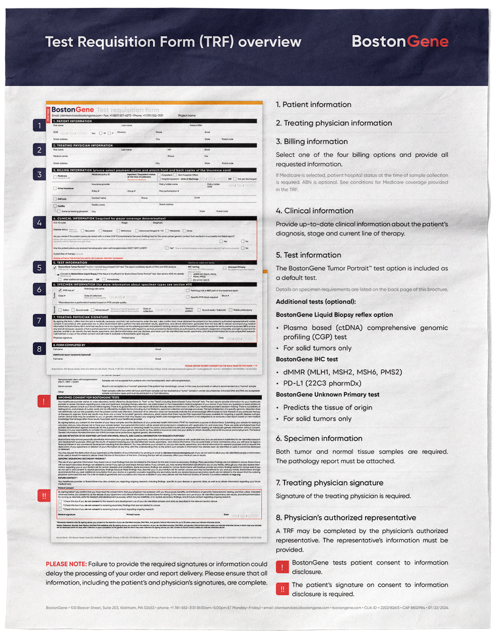
A one-page guide that introduces Japanese physicians to the BostonGene Tumor Portrait™ report. It explains what the report contains and how to read it. I designed it for BostonGene Japan.
Problems the document had to solve
1. A complex report for a first-time reader.
The Tumor Portrait report combines molecular findings, tumor microenvironment analysis, treatment options and clinical trials. A physician who has never seen it needs a way to understand its structure before reading the details. On the left side of the page I placed a miniature of the report with six numbered markers, and each marker corresponds to a numbered item in the text on the right. The reader can match any part of the report to its explanation immediately.
2. Information in an order that follows clinical logic.
The list moves from patient information and treatment timeline to key findings, tumor microenvironment, treatment recommendations and matched clinical trials. This mirrors the order in which a physician would work through a case, from the patient’s history to a decision about therapy.
3. Adapting materials for a new market.
The document is fully localized for Japanese physicians. The header carries the BostonGene Japan logo and the regulatory notice stating that the test is an unapproved medical device, placed where it is seen first. Japanese typography is set with generous line spacing and clear heading weights, so a text-heavy page remains easy to read.
4. Many details and conditions in a small space.
Each section has a short description, and the key components are separated into bullet lists (somatic and germline alterations, TMB and MSI, gene expression). Conditions and limitations, such as which cancer types the immunotherapy response prediction is available for, are set in a smaller, lighter type. They remain accessible without competing with the main message.
5. A clear next step.
A QR code, an email address and phone details with support hours (including the time zone) are placed in a separate block at the bottom of the page, so a physician who wants to learn more or place an order knows whom to contact.
6. Consistency with the rest of the materials.
The navy header, typography and color accents match the requisition form and the specimen guide. All documents read as one system, even though they are intended for different markets and tasks.
Outcome
A single page that allows a physician to understand the structure and value of the Tumor Portrait report within a minute, in their own language and in compliance with the regulatory requirements of the market.